
R and colour palettes part 2 - set your primary
- Published
- 2020-06-28
- Tagged
A few posts ago, I got very invested in how to build a nice colour palette in R. I went through how to build your own palette, select colours depending on the number of series you needed to show, and how to wrap it all up in some handy shortcut functions, so you could feel like a real pro as you bring your own colour palette in to help with whatever plot you need to build.
What could be better than a whole article devoted to colour palettes in R? Did you guess, doubling down with a follow-up article about niche aspects of colour palettes? If so, you’d be correct.
The story so far
By the end of our previous post, we’d build a company-specific colour palette that would automatically use our specified colours, and would even pick the best colours if we ended up plotting three (or four, or five) series against one another. We built all of the back-end, and then made it very easy to use by creating a function scale_colour_acme() which called the right palette and everything. Here’s a concise example of the sort of code we made:
1 | library("dplyr") |
2 | library("tidyr") |
3 | library("ggplot2") |
4 | library("colorspace") |
5 | |
6 | .acme_colours <- c( |
7 | red = "#eb3b5a", |
8 | orange = "#fa8231", |
9 | yellow = "#f7b731", |
10 | green = "#20bf6b", |
11 | topaz = "#0fb9b1", |
12 | light_blue = "#2d98da", |
13 | dark_blue = "#3867d6", |
14 | purple = "#8854d0" |
15 | )
|
16 | |
17 | acme_colours <- function(index = NULL, named = FALSE) { |
18 | # Default to everything |
19 | if (is.null(index)) { |
20 | index <- names(.acme_colours) |
21 | } |
22 | |
23 | # This works with integer or character values |
24 | return_value <- .acme_colours[index] |
25 | |
26 | if (!named) { |
27 | names(return_value) <- NULL |
28 | } |
29 | |
30 | return(return_value) |
31 | }
|
32 | |
33 | acme_colour_names <- function() { |
34 | names(.acme_colours) |
35 | }
|
36 | |
37 | acme_palette <- function() { |
38 | |
39 | acme_colour_length <- length(acme_colours()) |
40 | |
41 | function(n) { |
42 | stopifnot(n <= acme_colour_length) |
43 | return(acme_colours(1:n)) |
44 | } |
45 | }
|
46 | |
47 | scale_colour_acme <- function(...) { |
48 | ggplot2::discrete_scale( |
49 | aesthetics = "colour", |
50 | scale_name = "acme", |
51 | palette = acme_palette(), |
52 | ... |
53 | ) |
54 | }
|
Note that this example has a very naive colour-picking algorithm within acme_palette(). It’ll do for this example, but you might want to change it when you build yours. We can use this very easily to produce some nice plots - for example, for plotting how car manufacturers’ fuel efficiency has improved over time:
1 | # Set up data ----
|
2 | mileage <- |
3 | mpg %>% |
4 | filter(manufacturer %in% c("toyota", "honda", "nissan", "subaru", "hyundai")) %>% |
5 | group_by(manufacturer, year) %>% |
6 | summarise(mileage = mean(cty)) |
7 | |
8 | |
9 | # Example 1 ----
|
10 | # No primary series
|
11 | ggplot(mileage, aes(x = year, y = mileage, colour = manufacturer)) + |
12 | geom_line() + |
13 | scale_colour_acme() + |
14 | theme_minimal() |
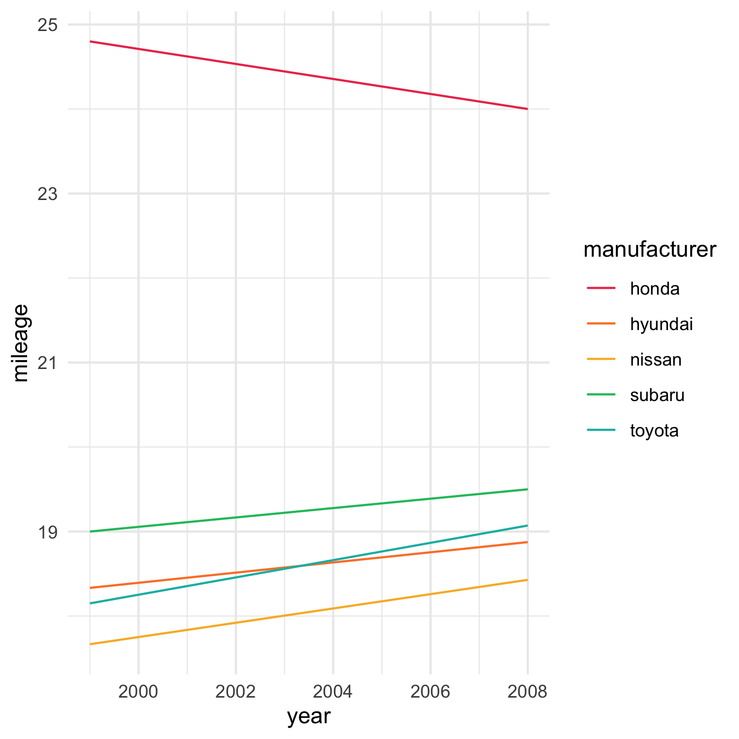
“What more could we do?” I hear you ask. Well..
You can be any colour you want, as long as you’re red
Let’s say we’re producing these plots for Toyota. We don’t really care whether Honda is yellow or blue or green or orange, but we know one thing: we have to be red. We should also be at the top. This is, after all, about us.
By default, R will sort your categories by whatever metric your categories can be sorted - factors will be sorted by level, while strings will be sorted alphabetically. It will then assign them, one-by-one, to the aesthetic values you’ve specified. So technically, you could convert your string values to factors, set their levels so that Toyota is always first, and then feed them into our algorithm…but that gets tiring, time after time. What if you could just tell your colour palette, “Hey, by the way, can you make sure that I’m always on top”?
1 | # Set up a "primary" scale
|
2 | scale_colour_acme <- function(primary = NULL, ...) { |
3 | scale <- ggplot2::discrete_scale( |
4 | aesthetics = "colour", |
5 | scale_name = "acme", |
6 | palette = acme_palette(), |
7 | ... |
8 | ) |
9 | |
10 | if (!is.null(primary)) { |
11 | scale$old_map <- scale$map |
12 | |
13 | scale$breaks <- function(values) { |
14 | c( |
15 | primary, |
16 | setdiff(values, primary) |
17 | ) |
18 | } |
19 | |
20 | scale$map <- function(self, x, limits = self$get_limits()) { |
21 | limits <- c( |
22 | primary, |
23 | setdiff(limits, primary) |
24 | ) |
25 | |
26 | self$old_map(x = x, limits = limits) |
27 | } |
28 | } |
29 | |
30 | return(scale) |
31 | }
|
32 | |
33 | # Example 2 ----
|
34 | # Ensure "toyota" is plotted in red
|
35 | ggplot(mileage, aes(x = year, y = mileage, colour = manufacturer)) + |
36 | geom_line() + |
37 | scale_colour_acme(primary = "toyota") + |
38 | theme_minimal() |
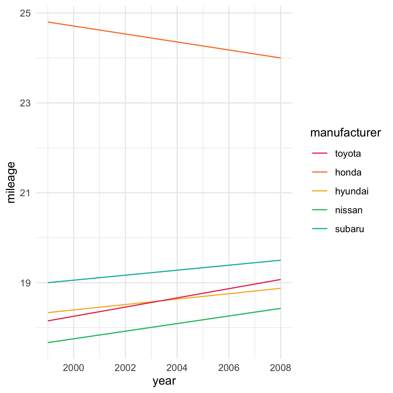
We do two cool things here. First, we hijack the scale’s map() function. This is what lets the scale map values (eg. “honda”, “hyundai”, “nissan”) to aesthetics (“#eb3b5a”, “#fa8231”, “#f7b731”). For discrete scales (like these, where we have a series of categories), the limits of the scale are considered to be all the distinct values - so this map() function will just be passed a list of ready-sorted categories. We step in before the mapping occurs, and gently re-arrange that list to ensure that our primary value (whatever that might be) is always on top. Second, we do the same for our breaks attribute. This determines the order that our categories are displayed in on our key. By ensuring we set the order correctly here, we make sure that not only is our primary always red, we can also ensure it’s on the top of the key (which is where it would be if it just happened to come first in the order anyway).
Highlighting some of the people, all of the time
Sometimes you only want to highlight one series, and every other series can just be dull grey or some other noncommittal colour. Think small multiples, or showing your series of interest against fifty other series. You could laboriously build a mapping of series to colours like a schmuck - but what if you could just say “if I don’t specify the colour to give this series, make it grey”? Then you could save all manner of time. Turns out, it’s not too hard - you just need to ensure your mapping function knows what to do with otherwise undefined values. We build on the mapping code we used above:
1 | # Build primary/other scales ----
|
2 | scale_colour_acme <- function(primary = NULL, other = NULL, ...) { |
3 | scale <- ggplot2::discrete_scale( |
4 | aesthetics = "colour", |
5 | scale_name = "acme", |
6 | palette = acme_palette(), |
7 | ... |
8 | ) |
9 | |
10 | if (!is.null(primary)) { |
11 | scale$old_map <- scale$map |
12 | |
13 | scale$breaks <- function(values) { |
14 | c( |
15 | primary, |
16 | setdiff(values, primary) |
17 | ) |
18 | } |
19 | |
20 | scale$map <- |
21 | if (is.null(other)) { |
22 | function(self, x, limits = self$get_limits()) { |
23 | limits <- c( |
24 | primary, |
25 | setdiff(limits, primary) |
26 | ) |
27 | |
28 | self$old_map(x = x, limits = limits) |
29 | } |
30 | } else { |
31 | function(self, x, limits = self$get_limits()) { |
32 | ifelse( |
33 | x == primary, |
34 | acme_colours(1), |
35 | other |
36 | ) |
37 | } |
38 | } |
39 | } |
40 | |
41 | return(scale) |
42 | }
|
43 | |
44 | |
45 | # Example 3 ----
|
46 | # Plot "toyota" in red, everything else in light grey
|
47 | ggplot(mileage, aes(x = year, y = mileage, colour = manufacturer)) + |
48 | geom_line() + |
49 | scale_colour_acme(primary = "toyota", other = "#AAAAAA") + |
50 | theme_minimal() + |
51 | theme(legend.position = "none") |
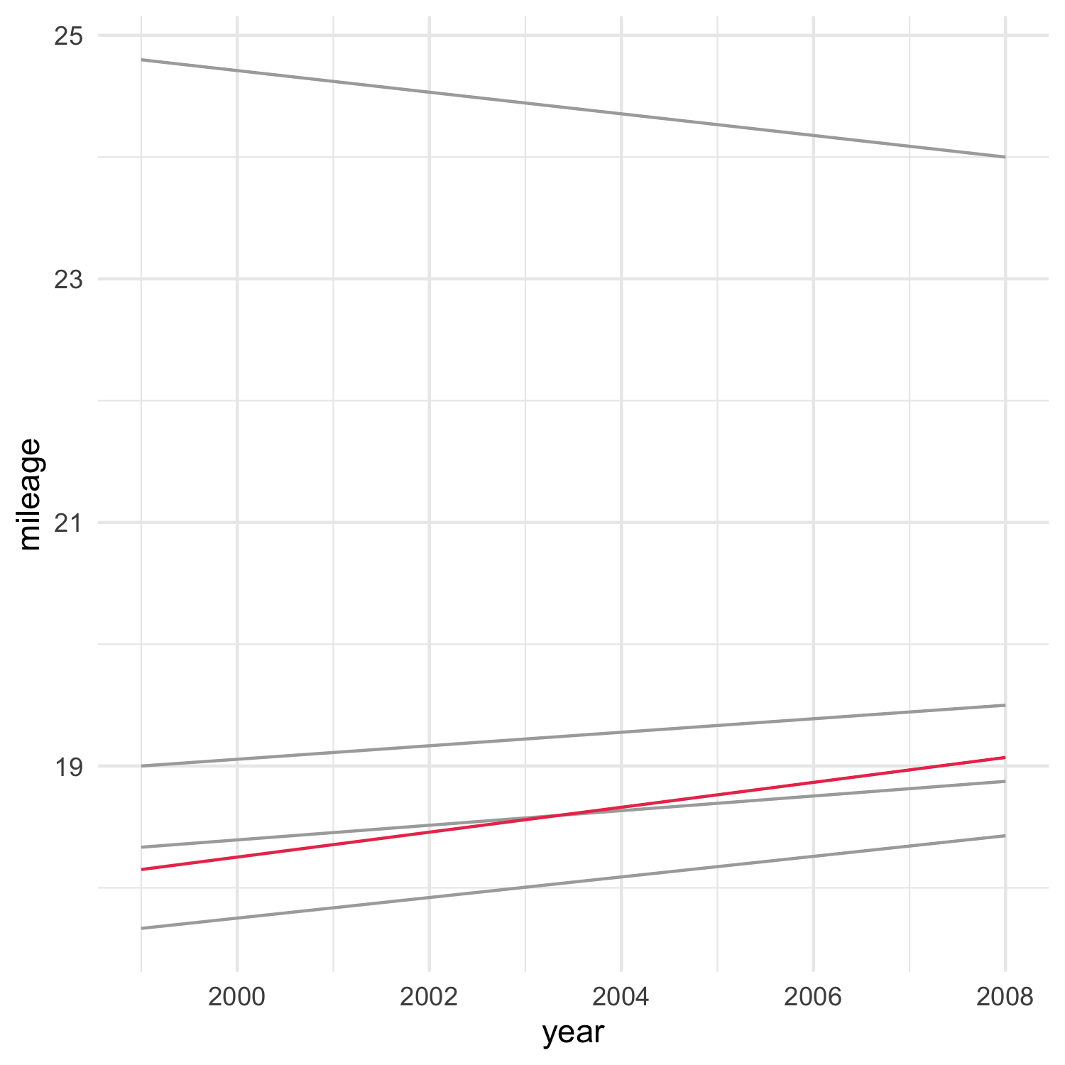
Normally, our mapping function would assign any non-manually-assigned categories, to the various colours we supply through the palette. Now, however, we’re giving ourselves a way to override this default behaviour. If we supply the other argument, we tell the mapping function to plot the primary category in our default Acme colour, and everything else in that other colour. We don’t really need the key here - we know what we want to focus on. It turns out you can actually do this with scale_colour_manual() through the na.value argument, but I think this is a bit nicer.
But I ordered extra emphasis!
What if you wanted to show the default even more? It turns we can use this “primary/other” distinction in other scales than colour and fill - scales we haven’t touched yet in this series:
1 | # Appying primary/other to other scales ----
|
2 | scale_size_specific <- function(..., .default) { |
3 | scale_map <- c(...) |
4 | stopifnot(all(names(scale_map) != "")) |
5 | |
6 | scale <- scale_size_manual(guide = "none") |
7 | scale$map <- function(self, x, limits = self$get_limits()) { |
8 | mapping <- scale_map[x] |
9 | mapping[is.na(mapping)] <- .default |
10 | mapping |
11 | } |
12 | |
13 | return(scale) |
14 | }
|
15 | |
16 | scale_alpha_specific <- function(..., .default) { |
17 | scale_map <- c(...) |
18 | stopifnot(all(names(scale_map) != "")) |
19 | |
20 | scale <- scale_alpha_manual(guide = "none") |
21 | scale$map <- function(self, x, limits = self$get_limits()) { |
22 | mapping <- scale_map[x] |
23 | mapping[is.na(mapping)] <- .default |
24 | mapping |
25 | } |
26 | |
27 | return(scale) |
28 | }
|
29 | |
30 | # Example 4 ----
|
31 | # Plot "toyota" in red and size 1, everything else light grey and size 0.5
|
32 | ggplot(mileage, aes(x = year, y = mileage, colour = manufacturer, size = manufacturer, alpha = manufacturer)) + |
33 | geom_line() + |
34 | scale_colour_acme(primary = "toyota", other = "#AAAAAA") + |
35 | scale_size_specific("toyota" = 1, .default = 0.5) + |
36 | scale_alpha_specific("toyota" = 1, .default = 0.8) + |
37 | theme_minimal() + |
38 | theme(legend.position = "none") |
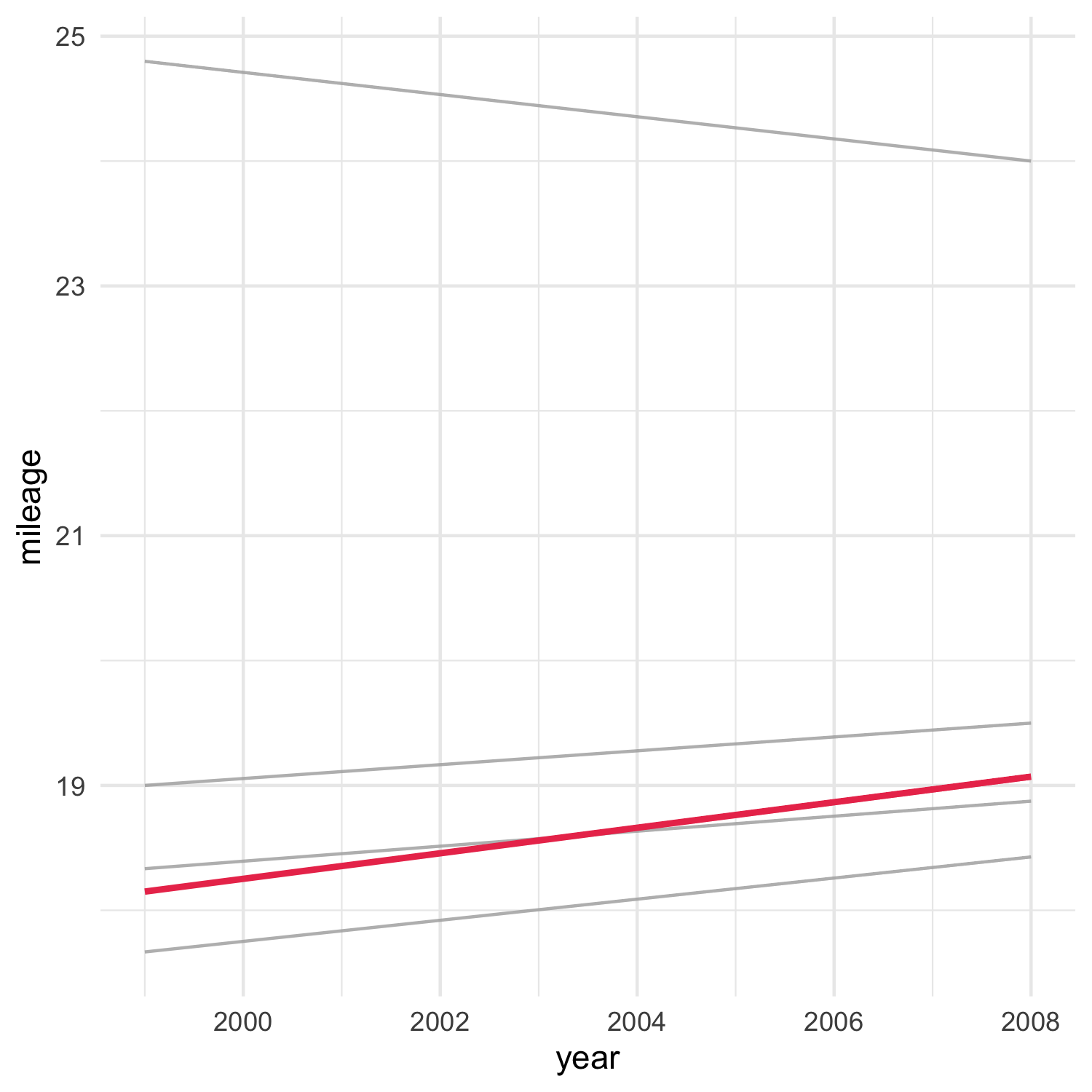
Here we’re building functions for both size and alpha, allowing us to split them along that primary/other distinction. Our “Toyota” series is blood-red, with a thicker and more solid line than every other series. Note that we also set guide = "none" for our scale_*_specific series: we’re assuming that the user is mainly going to be using these scales to add emphasis, so these aesthetic mappings don’t need to show up in the key.
Now, for this example, it might be considered a bit overkill to use colour and line thickness and alpha to distinguish Toyota from other series. But consider how we could use it on our previous, not-so-obviously-Toyota-centric plots, to give them a bit of emphasis:
1 | # Example 5 ----
|
2 | # Plot "toyota" in red and size 1, everything else gets a colour but is fainter and thinner
|
3 | ggplot(mileage, aes(x = year, y = mileage, colour = manufacturer, size = manufacturer, alpha = manufacturer)) + |
4 | geom_line() + |
5 | scale_colour_acme(primary = "toyota") + |
6 | scale_size_specific("toyota" = 1, .default = 0.5) + |
7 | scale_alpha_specific("toyota" = 1, .default = 0.8) + |
8 | theme_minimal() |
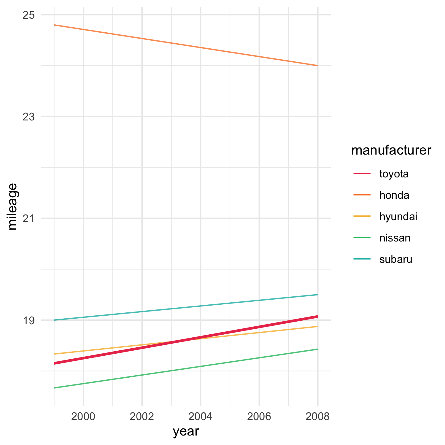
Now we can tell who’s who on the chart, using our colour palette - but our preferred series is very definitely highlighted with a thicker, bolder line, so we know where we should be focussing.
Additional resources
As before - you have your chance to see the code that made all of these plots, in one place. Grab it here.