Making a colour palette pseudo-package in R
- Published
- 16 April 2020
- Tagged
Late last year, I got sick. Stuck at home, I had nothing to do, and I decided to amuse myself by making a colour palette package in the R programming language. The goal of this package was to make it as easy as possible to use a pre-defined colour palette in data visualisation.
While I tend not to use this in its package form in my day-to-day, a lot of the functions I go into in this article get copied-and-pasted from project to project. One of these days I'll have enough time to package them up properly and get them into our local library, and then I'll never have to type a hex code in ever again.
While making a package is tricky, making a set of functions in one file which you port from project to project is an admirable stop-gap. So in the interest of sharing knowledge, this is what I've been doing.
First, catch your palette
Designing a good colour palette is almost as much work as coding the framework around it. A good data viz colour palette makes its individual elements distinguishable, from the background and from each other, even when the viewer is colour-blind or the visualisation is printed in greyscale. VizPalette is a great tool to determine how your colour palette looks for those with colour-blindness, while contrast-ratio allows you to quantify contrast ratios.
I'm not going to go into that kind of detail in this post - instead, I'm going to grab some colours from this nice "flat UI" colour palette site:
| #eb3b5a | #fa8231 | #f7b731 | #20bf6b | #0fb9b1 | #2d98da | #3867d6 | #8854d0 |
I haven't tested this palette for colour-blindness at all, but it'll do for our examples below.
The basics
The first thing we need to do is set these colours up as a vector. My preferred method is to set them up as a named vector, and then access them through an accessor function. While we're here, let's give us a nice "namespace" for these functions - if you're doing this for a company, you might want to put the company name in all the functions, to show that they're part of one set of functions. Let's make these part of Acme Corporation, objectively the best generic company name.
.acme_colours <- c(
  red = "#eb3b5a",
  orange = "#fa8231",
  yellow = "#f7b731",
  green = "#20bf6b",
  topaz = "#0fb9b1",
  light_blue = "#2d98da",
  dark_blue = "#3867d6",
  purple = "#8854d0"
)

# This function takes a character or integer index
acme_colours <- function(index = NULL, named = FALSE) {
  # Default to everything
  if (is.null(index)) {
    index <- names(.acme_colours)
  }

  # This works with integer or character values
  return_value <- .acme_colours[index]

  if (!named) {
    names(return_value) <- NULL
  }

  return(return_value)
}

# Another convenience function
acme_colour_names <- function() {
  names(.acme_colours)
}
Starting .acme_colours with a period doesn't do anything magical: it's just a kind of indicator that we're not supposed to use the value directly. If we were making a package, we could store this in the innards of the package proper, so it's never visible to the user. For this kind of work, though, hiding behind a full-stop is fine.
At this stage you may think we're almost done - after all, you could easily sub this in to your favourite ggplot code as follows:
ggplot(mpg) +
  geom_point(aes(x = displ, y = hwy, colour = as.character(cyl))) +
  scale_colour_manual(values = acme_colours()) +
  theme_minimal()
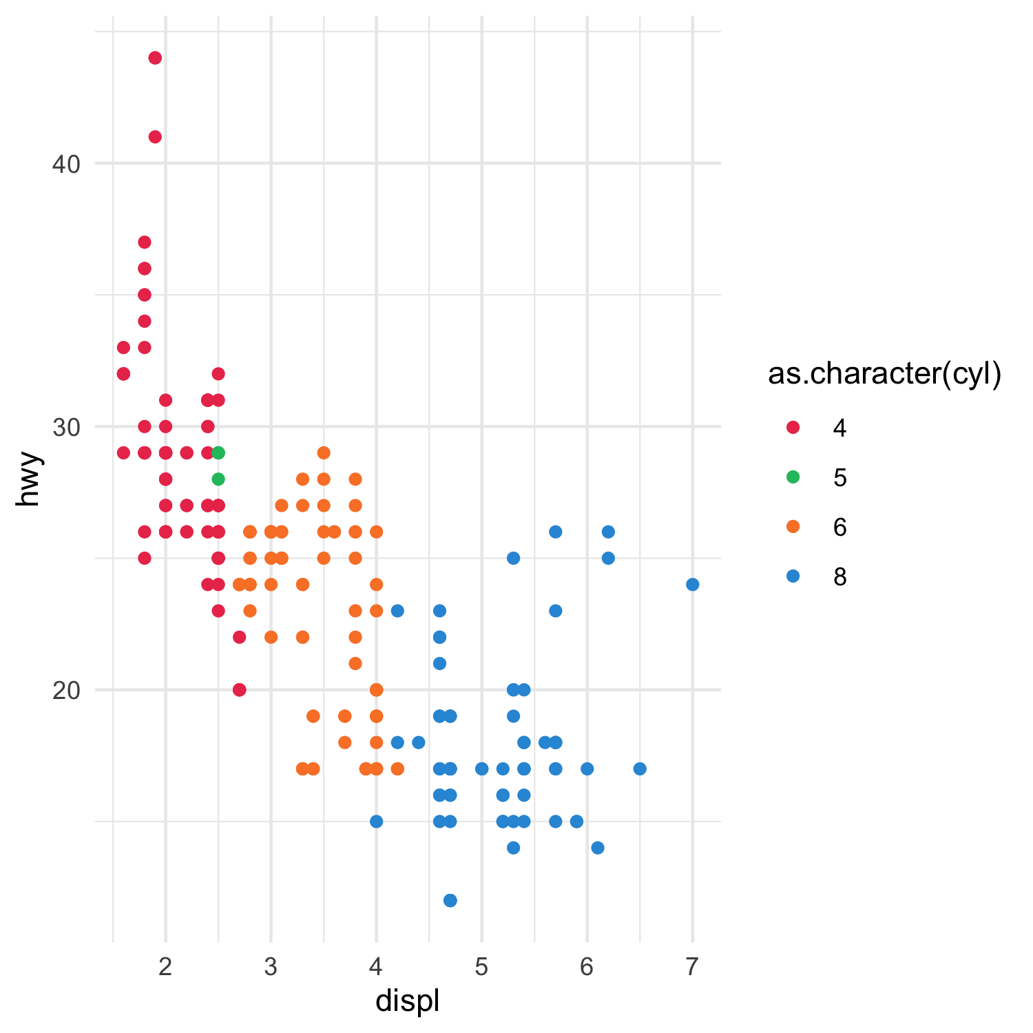
However, R's default strategy for picking colours is to work its way through the list. This means that even though we have the whole rainbow to pick from, R will just start from the first option and plod its way through, often stopping before we get to the blues and purples:
All the colours of the rainbow. Well, yellow.
We could rearrange our colour vector so we pick colours in a nicer order, but we can work smarter as well, with palettes.
Running the gamut
ggplot uses palette functions to pass off colour selection logic. There's nothing that really makes a palette function a palette function - it doesn't need a special class or anything. That means we can make our own palette functions, if we want.
There are two broad categories of palette, depending on whether we're looking at a discrete or a continuous scale. We'll start by examining how R generates discrete colour scales.
A discrete scale is a scale where we map a finite (often small) series of set categories to colours. When you tell R it needs to plot a discrete colour scale with a set of colours, it'll create a palette function that takes one argument (the number of colours you need) and returns a vector of colours. Actually, the palette function is a factory function (i.e. a function that returns functions) - this is a bit complex, but it means you can set up one function to do all this work and call it over and over again.
Replace...
We can mimic the standard R behaviour - and, in turn, to make that code above read more nicely - pretty easily:
# Our new palette function.
acme_palette <- function() {

  acme_colour_length <- length(acme_colours())

  function(n) {
    stopifnot(n <= acme_colour_length)
    return(acme_colours(1:n))
  }
}

# This is the function we use when plotting
scale_colour_acme <- function(...) {
    ggplot2::discrete_scale(
      aesthetics = "colour",
      scale_name = "acme",
      palette = acme_palette(),
      ...
    )
}
Now we don't have to use scale_colour_manual() everywhere - our code above can be rewritten as:
ggplot(mpg) +
  geom_point(aes(x = displ, y = hwy, colour = as.character(cyl))) +
  scale_colour_acme() +
  theme_minimal()
...and improve
But the reason we're doing this is to pick better colours! There's a couple of ways we could go about this.
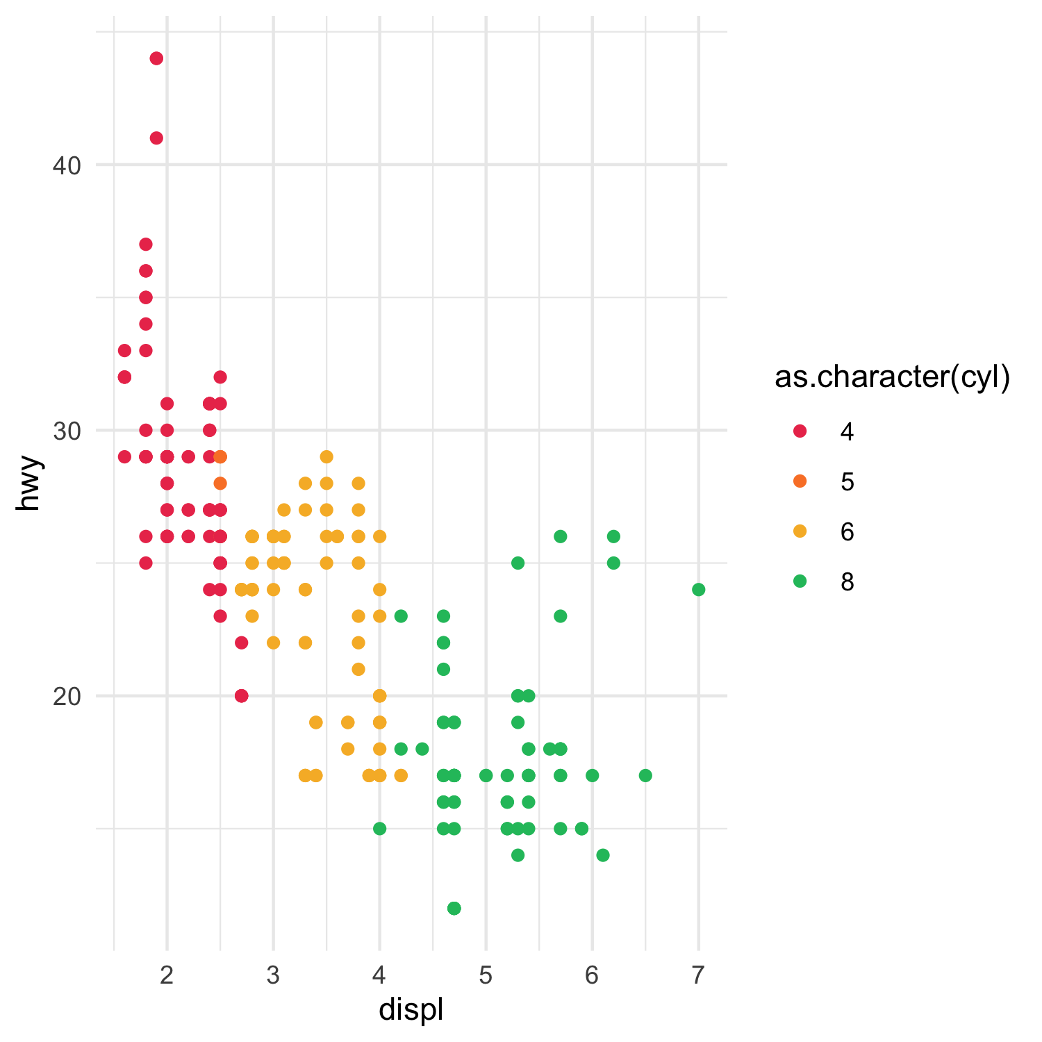
First, let's see how we can automate the colour selection process. We're going to build a little script that will automatically pick the colours furthest from each other - so if we know we need to map three categories, it'll take our basic red colour, something greenish, and something near the blue end of the spectrum:
acme_palette <- function() {
  acme_colour_length <- length(acme_colours())

  function(n) {
    stopifnot(n <= acme_colour_length)

    # Shortcut: if n = 1, we can just return the first colour
    if (n == 1) {
      return(acme_colours(1))
    }

    # Pick additional colours. Make them as spread out as possible
    interval_between_picks <- acme_colour_length / n

    additional_colour_indices <- 1 + (1:(n-1)) * interval_between_picks

    # Work out which colours to return
    colour_indices <- c(1, round(additional_colour_indices))

    return(acme_colours(colour_indices))
  }
}
Let's see how this looks:
ggplot(mpg) +
  geom_point(aes(x = displ, y = hwy, colour = as.character(cyl))) +
  scale_colour_acme() +
  theme_minimal()
Plotted with automatic colour picking.
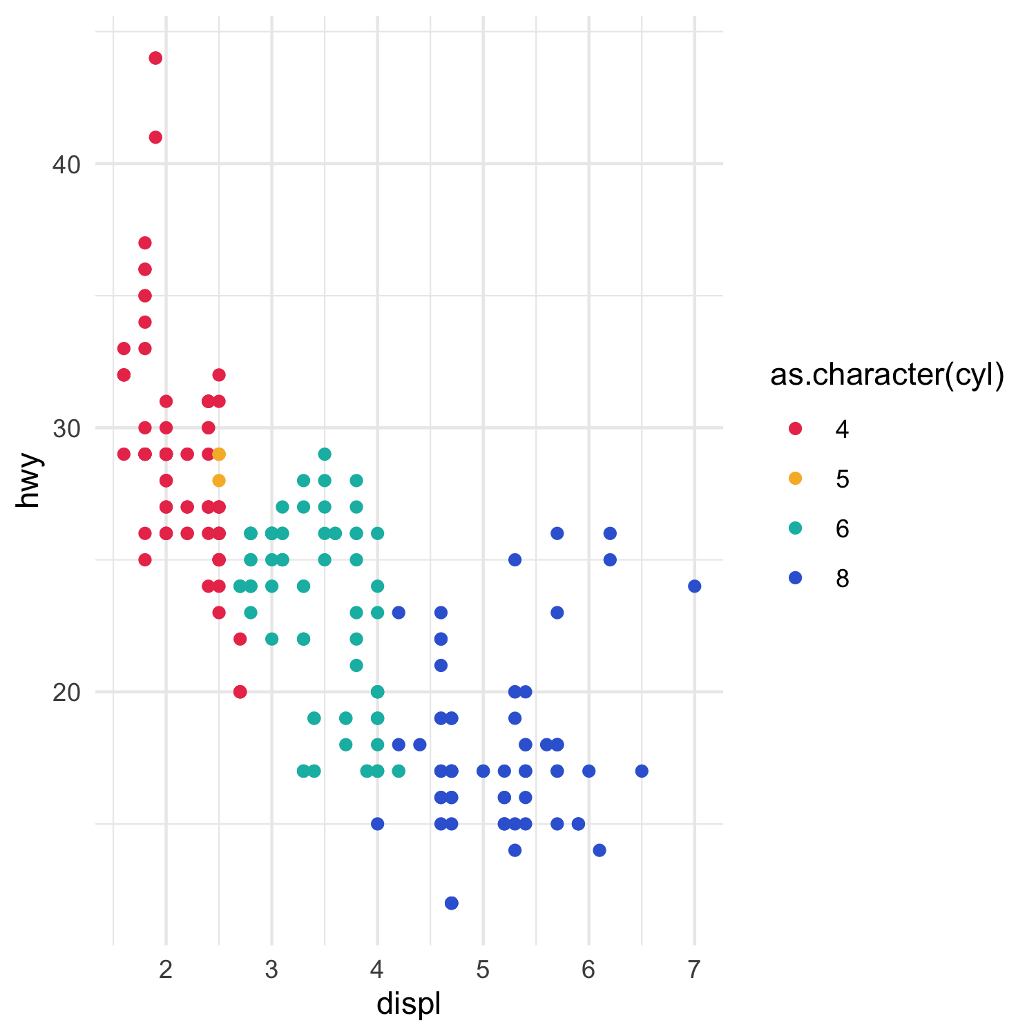
However, you may have Opinions about which colours to use in conjunction. You might have three "primary" colours you want to use in where possible, even if they're right next to each other on the spectrum. Or you could alter things so that when you have lots of colours, you pick alternating red-blue-yellow-purple for maximum contrast. Whatever your motivation, you can manually set the order of colours on a case-by-case basis, as follows:
acme_palette <- function() {

  acme_colour_length <- length(acme_colours())

  function(n) {
    stopifnot(n <= acme_colour_length)

    colour_indices <-
      if (n == 1) { "red" }
      else if (n == 2) { c("red", "blue") }
      else if (n == 3) { c("red", "green", "blue") }
      else if (n == 4) { c("red", "green", "orange", "blue") }
      # ... etc. etc.
      else if (n == 8) {
        c(
          "red", "topaz", "orange", "blue",
          "yellow", "dark_blue", "green", "purple"
        )
      }

    return(acme_colours(colour_indices))
  }
}
While this is a lot of work, it gives you ultimate authorial control over which colours to pick. As a bonus, it lets you line contrasting colours up against one another, as we've done with the green nestled in between the red and orange in this plot:
Plotted with "manual" colour picking.
To see the real effect of those contrasting colours, check out something a bit more complex:
For maximum colour contrast
This example hurts your eyes, but there's no way you'll miss the boundary between two categories. As a bonus, this contrast may well help you if the plot is printed out in greyscale, where differences between colours are even harder to distinguish.
Continuous scales
We've dealt with discrete scales - that is, scales where we have a predefined number of categories, which we can map to discrete colours. What about continuous scales - that is, scales where we want to map a continuous range to a spectrum? To do this, we need to build a different kind of palette.
Unlike discrete colour palettes (which are passed a numeric vector, length 1, representing the number of categories required), continuous colour palettes can expect to receive a vector of variable length, where every value is between 0 and 1 (where 0 is the minimum value, and 1 is the maximum), representing all the values we need to plot on the plot itself.
We can offload most of the hard work here onto ggplot2, and its dependency, colorspace:[1]
scale_colour_acme_c <- function(index = 1, colour_range = 0.75, ...) {
  low_colour <- acme_colours(index)
  high_colour <- colorspace::lighten(low_colour, amount = colour_range)

  ggplot2::scale_colour_gradient(
    low = low_colour,
    high = high_colour,
    ...
  )
}
This will give us a nice range of colours from our colour of choice, to white. Here's an example of it in use:
ggplot(mpg) +
  geom_point(aes(x = displ, y = hwy, colour = cty)) +
  scale_colour_acme_c() +
  theme_minimal()
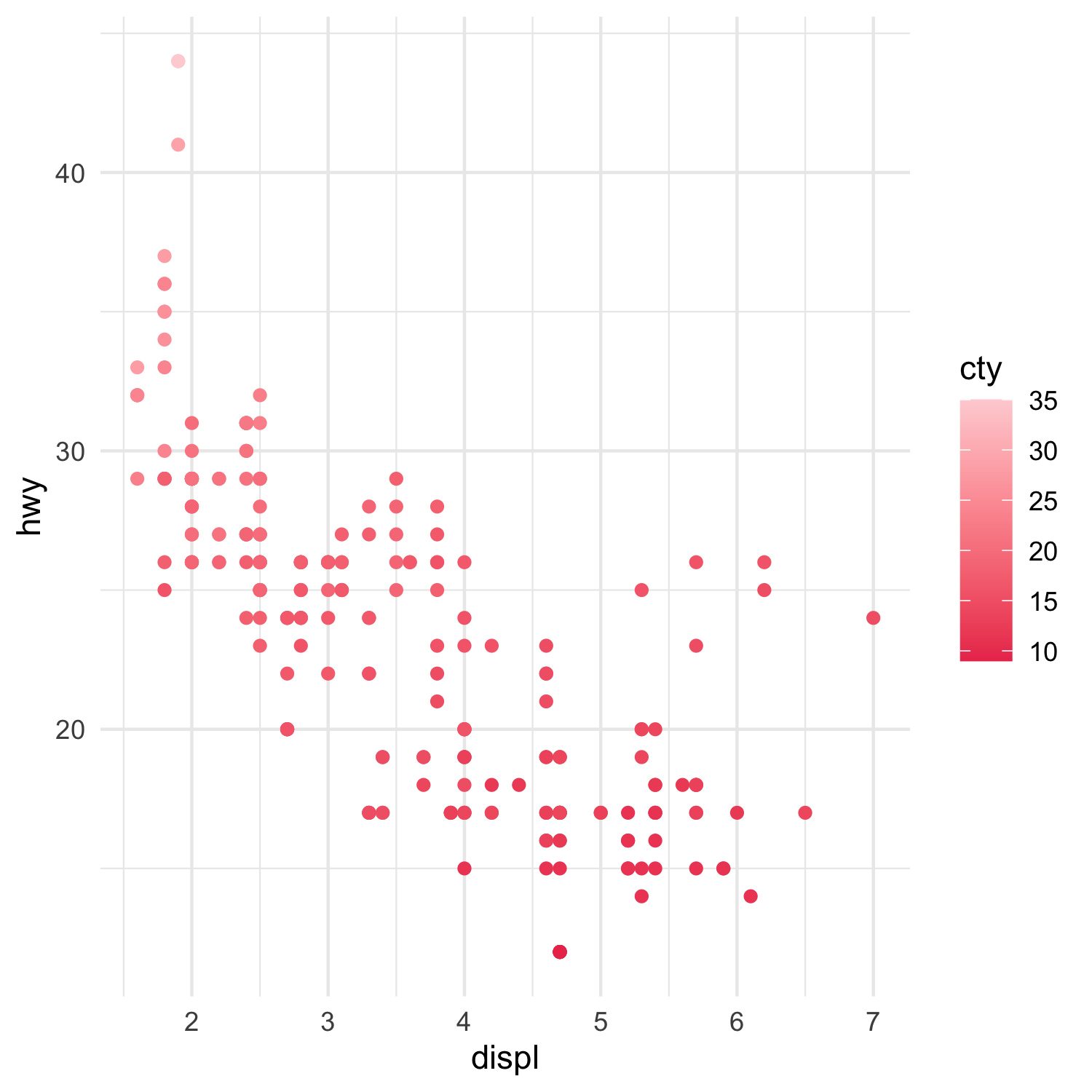
A sequential colour palette
There's another type of continuous scale we might encounter, however: the diverging sequence. This is when you want to have a central value (often zero) coded as something neutral - white or grey - while both positive and negative extremes are coded different colours. Thankfully, ggplot2 is here once again to do the heavy lifting.
scale_colour_acme_div <- function(high_index = 1, low_index = 5, ...) {
  high_colour <- acme_colours(high_index)
  low_colour <- acme_colours(low_index)

  ggplot2::scale_colour_gradient2(
    low = low_colour,
    high = high_colour,
    ...
  )
}
Let's use this in an example: here we're going to look at the fuel efficiency of all 2008-model Toyota cars in the mpg dataset, and use the diverging scale around the mean efficiency:
toyota_cars_2008 <-
  filter(mpg, manufacturer == "toyota", year == 2008)

mean_hwy <- mean(toyota_cars_2008$hwy)

ggplot(toyota_cars_2008) +
  geom_vline(xintercept = mean_hwy, linetype = 2) +
  geom_point(aes(y = model, x = hwy, colour = hwy)) +
  scale_colour_acme_div(midpoint = mean_hwy) +
  theme_minimal()
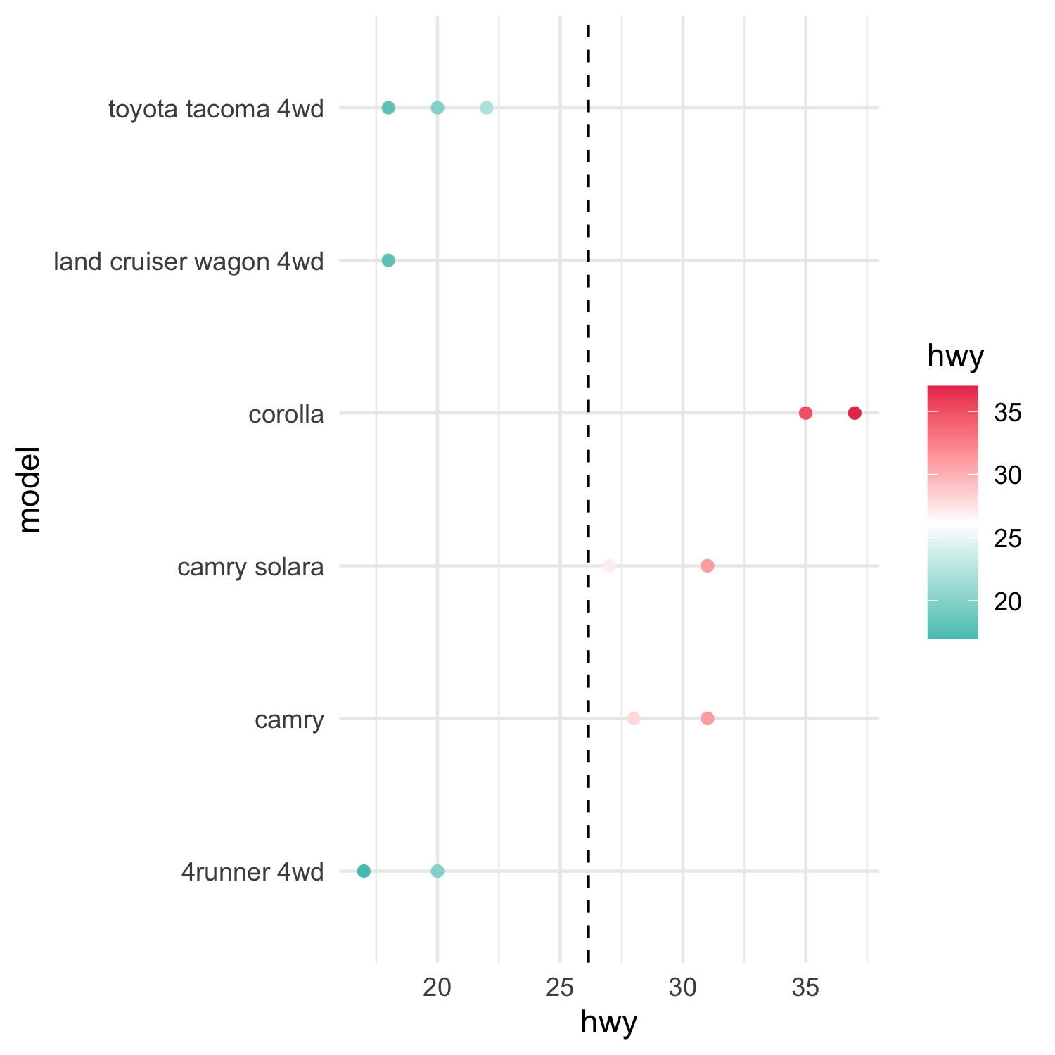
A diverging colour palette
Summing up
In this article, I've gone through:
- How to set up your own custom colour palette
- How to build your own palette, either using automatic or manual colour-picking
- How to use that to build your own
scalefunctions
In my next article[2] I'll show off some more advanced mucking about with ggplot's scale functions to let us do even more with even less.
The examples I've shown in this article were all generated through R. You can grab the script and data I used in the above examples, right here:
Additional links
Some additional reading that went into this post.