Gnuplot: an introduction
- Published
- 2014-02-15
- Tagged
Intro to GNUPlot
I discovered GNUPlot in the last year of my Ph.D. Before that I’d been using Plot.app, a rather handy GUI-based plotting application which produced some lovely graphs, although data manipulation was a bit tricky.
While Plot.app was a pretty good tool, development on it had pretty much stopped, and each time you upgraded your OS, another little thing would break. Finally, at some point their website went down and I was unable to grab the latest version. I decided that enough was enough: it was time to find a new plotting application.1
Unfortunately, there aren’t that many good data plotting packages for OS X. Lots of people love Origin, which is incredibly expensive and Windows-only. You can always go back to Excel if you either have lots of spare time to make your graphs look good, or you want everyone to know your graphs were made in Excel. Pro Fit seems to be an Origin competitor, but is again for-pay…and that’s all I can find.
Oh, and then there’s Gnuplot. Which looks kind of cool because you’re using text files to make your graphs, but also looks kind of incredibly complex because people use it to make complex 3D graphs or vector illustrations or what-have-you.
Thankfully, I decided to take up the challenge, and started to learn Gnuplot. It was a bit of a rocky road - I couldn’t find any “getting started” articles that really gelled with me, and so I spent the first few days struggling just to build a bar chart - but once I achieved sufficient fluency in the language, I found that I could create awesome, complex graphs in relatively short time. In addition, it was incredibly easy to re-use the graph display code for future projects: once I’d built one high-resolution XPS graph, I was well-placed to make hundreds more. Further, I could even automate the graph creation process, which meant I could make 25 identical graphs with differing data at once.
Since there’s no tutorial I liked on the internet, I figured I should make my own, putting down what I’ve learned in some sort of orderly manner. This is it.
Installing Gnuplot
Your first hurdle is actually getting Gnuplot. This section deals with installation on OS X: for other platforms, you may need to check out the official site.
If you have Xcode installed on your computer, you can install Gnuplot via homebrew: this is what I did and it’s by far the easiest way to install it. If not, you may be able to find a precompiled binary on the official site. I have to warn you that I haven’t tried this, so YMMV.
Once you’ve installed it, you should have access to the gnuplot command-line tool. This is what you use to turn a simple text file into a shiny graphic.
How Gnuplot works
Gnuplot isn’t like your regular GUI graphing application, and I think this is probably the hardest thing to get your head around as a new user. Gnuplot separates the data from the presentation: the data will sit in one file, the presentation code in another, and your graph will be output as a third file when you run the gnuplot command line utility.

The graphing process, in a nutshell
Here’s what I generally end up with when I’m making a graph:
data.dat: This is the file with all the data in it. The data should be space- or tab-separated, but if it’s comma-separated or similar, that’s also fine. For all examples here I’m going to use the following file:
1 | 1 4 |
2 | 2 10 |
3 | 3 7 |
4 | 4 2 |
5 | 5 0 |
6 | 6 12 |
7 | 7 5 |
8 | 8 4 |
9 | 9 6 |
10 | 10 8 |
plot.gnu: This is the file with all the commands in it. We refer to data.dat in plot.gnu, and we run the gnuplot command on plot.gnu.
graph.png: I tend to output to png, but as we’ll see, the format of your graph is up to you.
Sometimes you may want to split your data up, or produce multiple graphs, but usually these are the only three files you’ll need. The rest of this tutorial will be talking about what goes in plot.gnu.
A simple graph
Here’s a very, very simple example of a Gnuplot program:
1 | set terminal png |
2 | set output "graph.png" |
3 | plot "data.dat" |
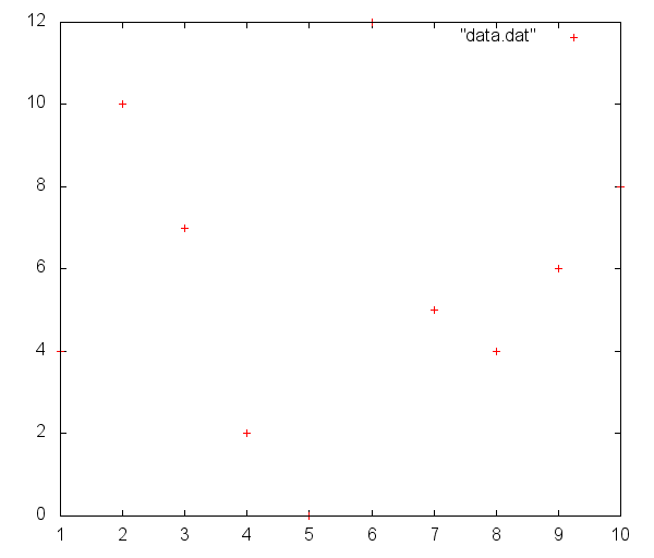
This is about as small a program as I can make. The graph it outputs isn’t the most amazing thing in the world, but it does display our data:

The simplest possible plot.
Of course, this graph looks a little…insipid. Some of its features aren’t exactly pleasing, and the duplicated axes and unnecessary key would make Tufte roll in his not-yet-dug grave.
The wonderful thing about Gnuplot is that pretty much everything is customisable, and we’ll be able to turn this horrid scatter-plot into a sexy bold line graph in no time.
First, let’s get rid of that key. It’s surprisingly easy: somewhere before the plot command, add a line with the command:
1 | unset key |
A lot of Gnuplot’s graph features are controlled via the set/unset command. You can set a whole heap of features about the key, but right now we just want to get rid of it. If you re-run Gnuplot now, you’ll see that the key has disappeared, like magic.
We can do some similar set magic to get rid of those annoying tics on our axes:
1 | set tics nomirror |
In this case, we’re passing an option to the set tics command, which controls everything about the tics on our axes. If you run Gnuplot now, you’ll notice that the tics are gone on our right and top borders.2
To be honest, those right and top borders are a bit extraneous as well. We can get rid of them using set border:
1 | set border 3 lw 2 |
This command is slightly more complex. As before, we’re using the set command, and we want to set the border property of the graph. The first argument to border is a number indicating which sides of the graph to have bordered. The number ranges from 0 to 15, and if you turn it into binary it’ll be a four-digit number. Each digit represents one border. 3 is 0011: it means we want just the bottom and left borders activated. The second argument (lw 2) sets the line width for the border. I tend to find a line width of 2 makes the border of the graph a little bit bolder and prettier.
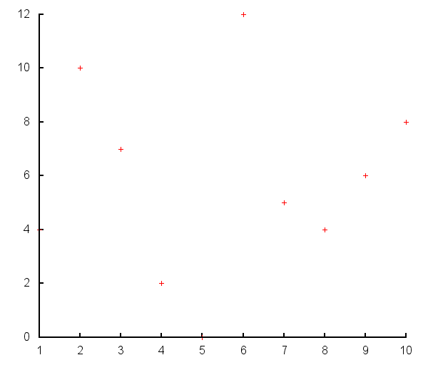
At this stage, if you’ve been following along, your graph should look a bit like this:

A slightly prettier-looking graph.
Those data points are still a bit puny, though. In fact, we don’t even want to have points here - a nice blue line would look a lot nicer. Thankfully, this is easy to change, by adding options to the plot command.
Much like the set command, the plot command takes a number of different arguments. The one that changes the style of plot is the with argument, that gets used like this:
1 | plot "data.dat" with lines |
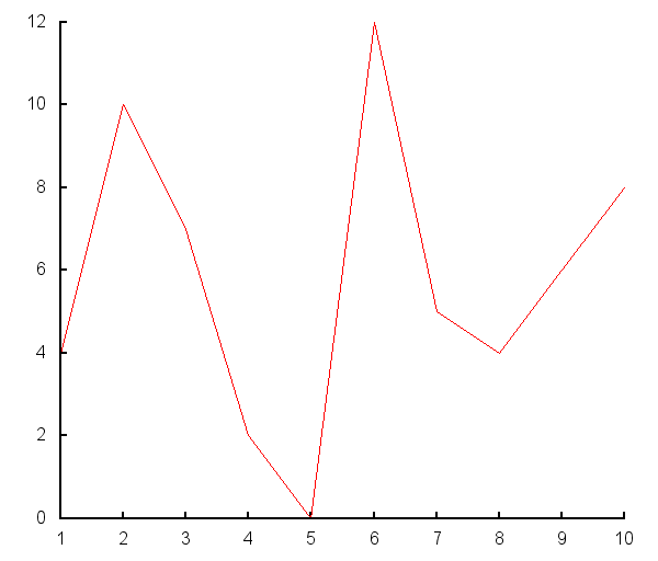
Just doing this, we’ll suddenly change the nature of the graph:

A plot with lines, now.
We can change the style of this graph by adding a few more arguments. Much in the same way that we used lw to control our border’s line-width previously, we can use an array of different arguments to affect the style and shape of our graph. The most common “style” arguments are:
- lw: Line width, as we’ve seen previously.
- lc: Line colour, which I’ll talk about in a bit.
- ls: Line style. This is generally a combination of line width and colour, defined earlier in the graph using
set style line. - ps: Point size. Used for
pointsgraphs to change the size of each point. - pt: Point type. Used for
pointsgraphs to turn your points into crosses, triangles, circles, and what-have-you.
The ones I’m going to use on this line are lw and lc. We’ve seen how lw gets used, but lc can take a number of arguments. The two most common forms of lc are:
lc "colourname"(e.g.lc "black")lc rgb "#AABBCC"(e.g.lc rgb "#FF0000")
Combining these, we modify our plot in the following manner:
1 | plot "data.dat" with lines lc rgb "#8899FF" lw 3 |
Now we should have a thick grey-blue line marking out our data. Good! Almost there. The final thing I would like to do is add some axis titles, so we know what we’re measuring. For this I’ll use the xlabel and ylabel properties:
1 | set xlabel "Day" font "Arial,18pt" |
2 | set ylabel "Widgets" font "Arial,18pt" |
I’ve added in an argument to set the font here. I have to warn you that I haven’t had much luck adding non-default fonts to Gnuplot: you may be forced to use Arial or Helvetica for your graphs, but you can always add labels later in another program if it’s really important.
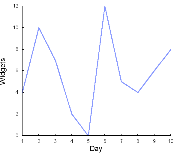
At this stage, we have a decent-looking, basic graph:

Our finished graph.
It’s not the most complex thing in the world, but it looks better than what Excel puts out.
The beauty of this is that you can take your .gnu file, put it in a new folder with a new data.dat, and produce the same-style graph for a completely different set of data.
More information
The Gnuplot manual is a great reference, and is available as a link from the Gnuplot homepage. You’ll also see a link to a number of demo graphs that may demonstrate some more complex tricks.
Given time I may write up another post or two in which I explore some of the more complex graphs I’ve made using Gnuplot. In which case I’ll go through more exciting methods step-by-step, like multiple plots, smashing graphs together, and how to get the elusive horizontal bar graph to work out.
-
I should point out that Plot2 is now under development: while I look forward to continued development on Plot, I probably won’t switch back now. If the following article is a mite too geeky (and the idea of coding your graphs doesn’t appeal), I highly recommend checking Plot2 out. ↩
-
I recommend running Gnuplot after every change you make, just so you can keep up to date with what you’re doing. There’s nothing like adding in ten lines, running Gnuplot, and finding out that one line of code spoiled everything. ↩
